在进行uni-app开发时,数据可视化是一个常见需求。u-charts作为一个高性能跨平台图表组件,能够满足我们在各种终端上展示图表的需求。本文将详细介绍如何在HbuilderX中使用u-charts的组件方式实现数据可视化。
安装步骤
安装u-charts非常简单,只需几个步骤:
1. 下载插件
首先需要从插件市场下载qiun-data-charts插件。你可以直接在HbuilderX的插件市场中搜索并下载,或者从u-charts官方插件地址下载。 下载Zip包或者是导入HbuilderX都需要看广告,如果是导入到HbuilderX中,会有指引,按步骤操作即可,下面是下载Zip包的步骤
2. 配置目录结构
下载完成后,我们需要在项目中创建正确的目录结构:
- 在项目根目录下新建
uni_modules文件夹 - 在
uni_modules目录中新建qiun-data-charts文件夹 - 将下载的Zip包内容全部复制到
qiun-data-charts目录中
项目根目录
├─uni_modules/
│  └─qiun-data-charts/
│     ├─components/
│     │  ├─qiun-data-charts/
│     │  │  └─qiun-data-charts.vue
│     │  ├─qiun-error/
│     │  │  └─qiun-error.vue
│     │  └─qiun-loading/
│     │     ├─loading1.vue
│     │     ├─loading2.vue
│     │     ├─loading3.vue
│     │     ├─loading4.vue
│     │     ├─loading5.vue
│     │     └─qiun-loading.vue
│     ├─js_sdk/
│     │  └─u-charts/
│     │     ├─config-echarts.js
│     │     ├─config-ucharts.js
│     │     ├─readme.md
│     │     ├─u-charts.js
│     │     └─u-charts.min.js
│     ├─static/
│     │  ├─app-plus/
│     │  │  └─echarts.min.js
│     │  └─h5/
│     │     └─echarts.min.js
│     ├─changelog.md
│     ├─license.md
│     ├─package.json
│     └─readme.md
└─ ...项目其他文件
完成这些步骤后,插件就已经准备好了
3. 配置easycom
在项目根目录的pages.json文件中,添加以下配置,实现组件的自动引入:
{
  "easycom": {
    "^qiun-data-charts": "@/uni_modules/qiun-data-charts/components/qiun-data-charts/qiun-data-charts.vue"
  },
  // 其他配置...
}
如果你的项目中同时使用了uView,可以这样配置:
{
  "easycom": {
    "^u-(.*)": "@/uview-ui/components/u-$1/u-$1.vue",
    "^qiun-data-charts": "@/uni_modules/qiun-data-charts/components/qiun-data-charts/qiun-data-charts.vue"
  },
  // 其他配置...
}
添加此配置后,你就可以在任何页面中直接使用<qiun-data-charts>组件,而无需手动导入。
基础使用示例
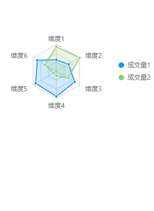
下面是一个使用u-charts实现雷达图的基础示例:
<template>
  <view class="charts-box">
    <qiun-data-charts
      type="radar"
      :opts="opts"
      :chartData="chartData"
    />
  </view>
</template>

<script>
  export default {
    data() {
      return {
        chartData: {},
        //您可以通过修改 config-ucharts.js 文件中下标为 ['radar'] 的节点来配置全局默认参数
        //如都是默认参数,此处可以不传 opts
        //实际应用中 opts 只需传入与全局默认参数中不一致的【某一个属性】即可实现不同样式
        opts: {
          color: ["#1890FF","#91CB74","#FAC858","#EE6666","#73C0DE","#3CA272","#FC8452","#9A60B4","#ea7ccc"],
          padding: [5,5,5,5],
          dataLabel: false,
          enableScroll: false,
          legend: {
            show: true,
            position: "right",
            lineHeight: 25
          },
          extra: {
            radar: {
              gridType: "radar",
              gridColor: "#CCCCCC",
              gridCount: 3,
              opacity: 0.2,
              max: 200,
              labelShow: true,
              border: true
            }
          }
        }
      };
    },
    onReady() {
      this.getServerData();
    },
    methods: {
      getServerData() {
        //模拟从服务器获取数据时的延时
        setTimeout(() => {
          //模拟服务器返回数据,实际使用时请替换为真实的API请求
          let res = {
            categories: ["维度1","维度2","维度3","维度4","维度5","维度6"],
            series: [
              {
                name: "成交量1",
                data: [90,110,165,195,187,172]
              },
              {
                name: "成交量2",
                data: [190,210,105,35,27,102]
              }
            ]
          };
          this.chartData = JSON.parse(JSON.stringify(res));
        }, 500);
      },
    }
  };
</script>

<style scoped>
  /* 请根据实际需求修改父元素尺寸,组件会自动识别宽高 */
  .charts-box {
    width: 100%;
    height: 300px;
  }
</style>
数据格式说明
u-charts使用的数据格式比较统一,主要包含两部分:
- categories: 类别数组,表示X轴的数据点标签
- series: 系列数组,包含多个数据系列,每个系列有name和data属性
例如:
{
  categories: ["一月","二月","三月","四月","五月","六月"],
  series: [
    {
      name: "系列1",
      data: [150, 230, 224, 218, 135, 147]
    },
    {
      name: "系列2",
      data: [50, 130, 124, 118, 235, 47]
    }
  ]
}
常见图表类型
u-charts支持多种图表类型,可以通过修改组件的type属性来切换:
- 折线图:
line - 柱状图:
column - 饼图:
pie - 雷达图:
radar - 散点图:
scatter - 面积图:
area - 圆环图:
ring - 漏斗图:
funnel - 玫瑰图:
rose - 混合图:
mix
高级功能
图表交互
如果需要实现图表的点击交互,可以添加@getIndex事件:
<qiun-data-charts
  type="column"
  :chartData="chartData"
  @getIndex="getIndex"
/>
methods: {
  getIndex(e) {
    console.log(e.currentIndex.series);
    console.log(e.currentIndex.index);
    // 可以根据点击的索引执行跳转或其他操作
  }
}
自定义主题
u-charts支持自定义主题,可以通过全局配置或局部配置实现:
- 全局配置:修改
uni_modules/qiun-data-charts/js_sdk/u-charts/config-ucharts.js文件 - 局部配置:通过
:opts属性传入自定义配置
动态切换图表
可以通过动态修改type属性实现图表类型的切换:
<qiun-data-charts
  :type="chartType"
  :chartData="chartData"
/>
data() {
  return {
    chartType: 'line', // 默认为折线图
    chartData: {}
  }
},
methods: {
  changeChartType(type) {
    this.chartType = type; // 切换图表类型
  }
}
营养监测图表案例
下面是一个实际应用中的营养数据曲线图表组件,使用TypeScript封装,支持自定义渐变色:
<template>
	<view class="chart-container">
		<qiun-data-charts
			type="line"
			:opts="chartOpts"
			:chartData="formatChartData"
			:canvasId="canvasId"
			background="none"
		/>
	</view>
</template>

<script lang="ts">
// 移除手动导入,使用easycom自动导入

interface LineColor {
	[index: number]: string | number
}

interface NutritionSeries {
	name: string
	linearColor: LineColor[]
	data: number[]
}

interface ChartData {
	categories: string[]
	series: NutritionSeries[]
}

interface YAxisConfig {
	min: number
	max: number
}

export default {
	name: 'nutrition-chart',
	// 移除components注册,easycom会自动注册

	props: {
		// 餐食类型数组
		meals: {
			type: Array as () => string[],
			default: () => ['早餐', '午餐', '晚餐']
		},

		// 营养数据数组
		nutritionData: {
			type: Array as () => number[][],
			default: () => []
		},

		// Y轴配置
		yAxis: {
			type: Object as () => YAxisConfig,
			default: () => ({
				min: 0,
				max: 50
			})
		},

		// canvas ID
		canvasId: {
			type: String,
			default: 'nutritionChart'
		},

		// 添加线条名称列表属性
		lineNames: {
			type: Array as () => string[],
			default: () => ['总热量', '碳水化合物', '脂肪', '蛋白质']
		}
	},

	computed: {
		formatChartData(): ChartData {
			return {
				categories: this.meals,
				series: this.nutritionData.map((data: number[], index: number) => ({
					name: this.lineNames[index] || `线条${index + 1}`,  // 使用传入的名称列表
					linearColor: this.getLineColor(index),  // 获取对应的颜色配置
					data: data || []
				}))
			}
		},

		chartOpts() {
			return {
				padding: [15, 10, 0, 15],
				background: 'rgb(255, 232, 215)',
				enableScroll: false,
				dataLabel: false,
				dataPointShape: false,
				legend: {
					show: false
				},
				xAxis: {
					disableGrid: true,
					type: 'category',
					axisLine: true,
					axisLineColor: '#cccccc'
				},
				yAxis: {
					dashLength: 2,
					data: [{
						min: this.yAxis.min,
						max: this.yAxis.max,
						splitNumber: 5
					}],
					showTitle: false,
					gridColor: 'transparent'
				},
				extra: {
					line: {
						type: "curve",
						width: 2,
						activeType: "hollow",
						linearType: "custom",
						tension: 0.5
					}
				},
				width: 750,
				height: 300
			}
		}
	},

	methods: {
		// 根据索引获取对应的颜色配置
		getLineColor(index: number): LineColor[] {
			const colorConfigs: LineColor[][] = [
				[ // 第一条线的颜色
					[0, '#42d392'],
					[0.25, '#50d89d'],
					[0.5, '#5edca8'],
					[0.75, '#6ce0b3'],
					[1, '#7ae4be']
				],
				[ // 第二条线的颜色
					[0, '#ff6b6b'],
					[0.25, '#ff7a7a'],
					[0.5, '#ff8989'],
					[0.75, '#ff9898'],
					[1, '#ffa7a7']
				],
				[ // 第三条线的颜色
					[0, '#ffa500'],
					[0.33, '#ffb733'],
					[0.66, '#ffc966'],
					[1, '#ffdb99']
				],
				[ // 第四条线的颜色
					[0, '#8a2be2'],
					[0.33, '#9f55e7'],
					[0.66, '#b47fec'],
					[1, '#c9a9f1']
				]
			]
			return colorConfigs[index] || colorConfigs[0]
		}
	}
}
</script>

<style lang="scss" scoped>
.chart-container {
	height: 300rpx;
	width: 100%;
	margin: 30rpx 0;
	position: relative;

	:deep(.qiun-charts) {
		width: 100% !important;
		height: 100% !important;
	}
}
</style>
注意事项
- 确保父容器有明确的宽高,u-charts会自动适应父容器尺寸
- 移动端建议开启canvas2d模式,提高性能:
:canvas2d="true" - 数据量较大时,建议开启图表滚动功能:
:enableScroll="true" - 如遇到图表层级问题,可以调整z-index或使用
:inScrollView="true"属性
总结
u-charts作为一款优秀的跨平台图表组件,在uni-app开发中能够满足大多数数据可视化需求。通过组件方式使用,不仅简化了开发流程,还提供了丰富的配置选项和交互方式。希望本文能够帮助你快速上手u-charts,实现精美的数据可视化效果。
如果你需要更复杂的图表功能,可以参考u-charts官方文档获取更多信息。